Friday Film Noir
The Posters Of The Classic Noir Period
Loving movie posters is a curious passion. Today, the one-sheet theatrical poster that hangs in a theatre lobby or is plastered in subway stations or bus stops represents but of one of a bevy of resources studios have to market their products. Theatrical trailers play in front of films, tv spots take up airtime during commercial breaks, YouTube videos are prefaced with said tv spots, banners are displayed on the home pages of websites, social media hashtags are endlessly bandied about to jolt potential patrons into excitement, mini-documentaries (sometimes referred to as ‘featurettes’) are released online, the list is impressive, to say the least.
Marketing a film in the 21st century is a full-on operation, and as such, some techniques that held more value yesteryear are no longer considered to be the primary resource to build up anticipation. Among those tools is the film’s poster, the image, or collage of images, that should represent the essence of what a film has to offer, either a teasing image or outright declaration of the awesomeness one is about to witness. For some years already film posters have mostly been the result of perfunctory collaging via specialty computer programs. Decades ago, however, the movie’s poster held much more sway, and as such more effort was put into creating them.
The glory days of the classic film noir era, the 1940s and 50s, aligned with the period during which the overwhelming majority of theatrical posters were hand-drawn or painted. Ironically enough, despite that more a conceited effort was invested to make beautiful looking advertisements, the studios nevertheless held more power than the artists that produced the works of art. A shockingly high number of posters of the era have gone un-credited, in part because, however beautiful many were, they were churned out fairly quickly, with little thought put into awarding praise to the individuals behind the work. That being said, there was undeniably a level of higher artistry considered when producing them. Certain studios tended to adopt specific styles (Warner Bros, for instance, argued for the stars’ faces to usually be front and center with limited colour schemes), but when looking at some of the posters from this period, it is difficult to deny their allure and sensuality, two things film noir depends on a great deal.
Without further ado, here are but some of the posters that struck my fancy whilst searching for new movies to review and reading some excellent sources on the matter. It goes without saying that some classics don’t appear here, and classics they certainly are, but the ones featured have in several cases very arresting, sometimes even peculiar qualities about them.
As for sources, arguably the best book on the topic of theatrical film noir posters from the 1940s and 1950s is The Art of Noir: The Posters and Graphics From the Classic Era of Film Noir, written and curated by noir scholar Eddie Muller. Published in 2014 by Overlook Books, it is essentially 338 pages of reprints of posters assorted in chapters defining studios styles, adaptations from novels, big stars names, master directors, foreign market styles, and the like. For anyone with a modicum of interest in the topic, that is the book to pick up, hands down.

Very few posters of the era embrace pink like this one for Billy Wilder’s legendary film. What’s more, the colour of the title is an even richer tint of pink, making it really stand out. The placement of Edward G. Robinson’s head makes the poster all the more curious. Headshots are extremely common in posters, but the manner in which Robinson’s is handled is odd to say the least, just hanging around on the right-hand side, all by its lonesome self, not to mention its small stature in relation to Fred MacMurray and Barbara Stanwyck.

This French poster for Gun Crazy puts emphasis on some of the film’s better assets. Never ones to shy away from sexuality, the French obviously embrace any opportunity to shine a light on a beautiful actor or actress, making them as alluring as possible. With a huge cigarette sticking out through of her beautiful lips, two smoking pistols in her hands and, well, you know, Peggy Cummins is clearly the star of the show.

The font and colour used to highlight the film’s title is stunning. An especially nice touch is the letter ‘L’ which extends far above Gene Tierney. Speaking of which, she and Dana Andrews look quite spiffy, even though they don’t quite resemble their actual selves (which was far more often the case then some might think whenever artists hand drew actors for posters). Best of all is the odd choice of a green background, a semi-regular selection when it came to 20th Century Fox theatrical one-sheets.

More like the cover of a pulpy novel than a film poster, this representation of Robert Aldrich’s gritty, extremely cynical motion picture has all the makings of a naughty movie. Micky Spillane, portrayed by Ralph Meeker, is making love to a woman that looks either dead or comatose, the film advertises ‘Blood-Red Kisses’, Spillane’s ‘Latest H-Bomb’ (which is a teasing suggestion of what happens in the movie) and the actual title is tattooed on some luscious lips.

How fitting is it that the main protagonist is played by an actor with the name Power as his mysterious eyes, with a cigarette hanging from the mouth as they always do, stares down at a trio of beautiful women? The latter is also looking back up at him, although not with the same sense of alluring confidence. While the poster’s sexual politics are antiquated by early 21st century standards, there’s no denying that the artist knew how to get its specific message across.
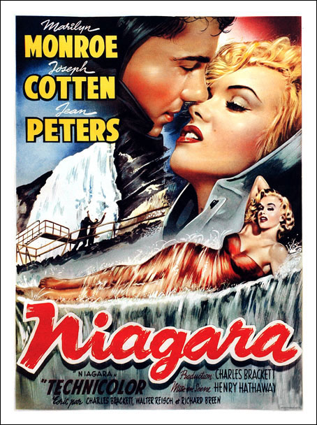
An extraordinarily dramatic rendition of the action and passions that erupt through the film, Niagara‘s theatrical one-sheet is one of the very best of the era. Monroe and Joseph Cotton get up close and personal with gorgeous detail in the upper right corner, the left-hand side features one of the film’s most impressive and tension-filled moments and the entire bottom half is dominated, not just by Marylin Monroe herself, but Monroe completely wet by the falls. Who didn’t want to see this movie when they noticed the poster in the lobby?

The Spiral Staircase might not fit the definition of film noir as comfortably as its brethren, but it contains enough of its elements to be regularly included in the conversation. The poster does a marvellous job at emphasizing the picture’s tone, which dabbles in the thriller and horror genre as much as it does in noir. Dorothy McGuire looks somewhat hesitantly to her left, as if afraid to find what’s there, as a rich, dark blue background with an eerie-looking house decorate the background.

This poster is much more akin to what moviegoers are accustomed to seeing in modern times, notwithstanding the absence of Photoshop work. This hand-drawn work of art does not emphasize one element more than any others, preferring a collage of characters and moments that take place in the movie itself. A brawl, a dead woman, handsomely dressed folk and a really nice image of two characters leaning on a lamppost with the light shining straight down on them. It’s very busy, but also very clear.

Beautiful, romantic title font, crisp black background that doesn’t distract, and of course Rita Hayworth dominating everything else. The smile she sports and her seductive pose says everything the moviegoer needs to know about her as they enter the theatre room: Gilda is having a blast being who she is, with nary a care in the world. Granted, the movie eventually reveals that all is not what it seems, but the titular character’s devil may care attitude is what so many people tend to remember about the film anyways. That cigarette probably wants to get back into her mouth asap.

While there are definitely more arresting posters one could choose from, this one for The Phantom Lady has many curious qualities about it. For one, the title utilizes two very distinct fonts, a bold one emphasizing shock of Phantom, and a silky ‘L’ for Lady. Just above the title, drawn in red, is the tag line ‘The Most Talked About Mystery in Ten Years!’ What was the big mystery film from ten years ago, and how could people be talking about the mystery of a film they have even seen yet? Best of all is the centerpiece, a ghostly blue woman looking back in surprise. Is she the phantom lady or is she the one taken aback by her? Watch the movie to find out!
-Edgar Chaput
Editor’s Note: This article is part of our weekly Friday Noir column.